Design Principles
Core principles that guide HeroUI v3's design and development
HeroUI Native follows 9 core principles that prioritize clarity, accessibility, customization, and developer experience.
Core Principles
1. Semantic Intent Over Visual Style
Use semantic naming (primary, secondary, tertiary) instead of visual descriptions (solid, flat, bordered). Inspired by Uber's Base design system, variants follow a clear hierarchy:
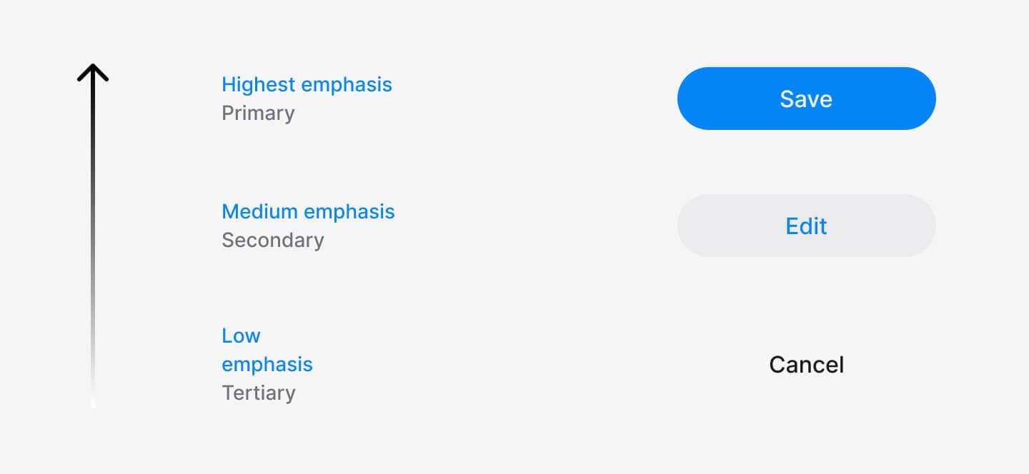
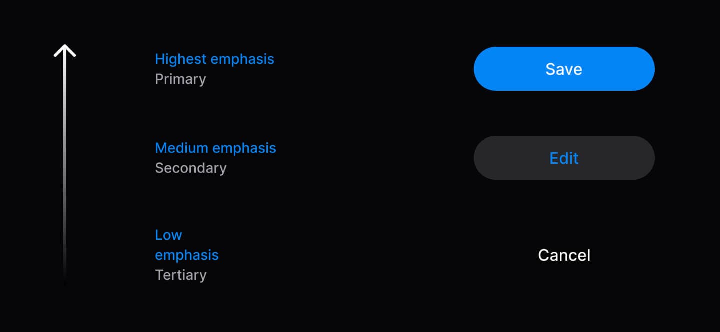
// ✅ Semantic variants communicate hierarchy
<Button variant="primary">Save</Button>
<Button variant="secondary">Edit</Button>
<Button variant="tertiary">Cancel</Button>| Variant | Purpose | Usage |
|---|---|---|
| Primary | Main action to move forward | 1 per context |
| Secondary | Alternative actions | Multiple allowed |
| Tertiary | Dismissive actions (cancel, skip) | Sparingly |
| Danger | Destructive actions | When needed |
2. Accessibility as Foundation
Accessibility follows mobile development best practices with proper touch accessibility, focus management, and screen reader support built into every component. All components include proper accessibility labels and semantic structure for VoiceOver (iOS) and TalkBack (Android).
import { Tabs } from 'heroui-native';

<Tabs value="profile" onValueChange={setActiveTab}>
  <Tabs.List>
    <Tabs.Indicator />
    <Tabs.Trigger value="profile">
      <Tabs.Label>Profile</Tabs.Label>
    </Tabs.Trigger>
    <Tabs.Trigger value="security">
      <Tabs.Label>Security</Tabs.Label>
    </Tabs.Trigger>
  </Tabs.List>
  <Tabs.Content value="profile">Content</Tabs.Content>
  <Tabs.Content value="security">Content</Tabs.Content>
</Tabs>
3. Composition Over Configuration
Compound components let you rearrange, customize, or omit parts as needed. Use dot notation to compose components exactly as you need them.
// Compose parts to build exactly what you need
import { Accordion } from 'heroui-native';

<Accordion>
  <Accordion.Item value="1">
    <Accordion.Trigger>
      Question Text
      <Accordion.Indicator />
    </Accordion.Trigger>
    <Accordion.Content>Answer content</Accordion.Content>
  </Accordion.Item>
</Accordion>
4. Progressive Disclosure
Start simple, add complexity only when needed. Components work with minimal props and scale up as requirements grow.
import { Button, Spinner } from 'heroui-native';
import { Feather } from '@expo/vector-icons';

// Level 1: Minimal
<Button>Click me</Button>

// Level 2: Enhanced
<Button variant="primary" size="lg">
  <Feather name="check" size={20} />
  <Button.Label>Submit</Button.Label>
</Button>

// Level 3: Advanced
<Button variant="primary" isDisabled={isLoading}>
  {isLoading ? (
    <>
      <Spinner size="sm" />
      <Button.Label>Loading...</Button.Label>
    </>
  ) : (
    <Button.Label>Submit</Button.Label>
  )}
</Button>
5. Predictable Behavior
Consistent patterns across all components: sizes (sm, md, lg), variants, and className support. Same API, same behavior.
import { Button, Chip, Avatar } from 'heroui-native';

// All components follow the same patterns
<Button size="lg" variant="primary" className="custom">
  <Button.Label>Click me</Button.Label>
</Button>
<Chip size="lg" color="success" className="custom">
  <Chip.Label>Success</Chip.Label>
</Chip>
<Avatar size="lg" className="custom">
  <Avatar.Fallback>JD</Avatar.Fallback>
</Avatar>
6. Type Safety First
Full TypeScript support with IntelliSense, auto-completion, and compile-time error detection. Extend types for custom components.
import type { ButtonRootProps } from 'heroui-native';

// Type-safe props and event handlers
<Button
  variant="primary"  // Autocomplete: primary | secondary | tertiary | ghost | danger | danger-soft
  size="md"          // Type checked: sm | md | lg
  onPress={() => {   // Properly typed press handler
    console.log('Button pressed');
  }}
>
  <Button.Label>Click me</Button.Label>
</Button>

// Extend types for custom components
interface CustomButtonProps extends Omit<ButtonRootProps, 'variant'> {
  intent: 'save' | 'cancel' | 'delete';
}
7. Developer Experience Excellence
Clear APIs, descriptive errors, IntelliSense and AI-friendly markdown docs.
8. Complete Customization
Beautiful defaults out-of-the-box. Transform the entire look with CSS variables through Uniwind's theming system. Every slot is customizable.
/* Custom colors using Uniwind's theme layer */
@layer theme {
  @variant light {
    --accent: oklch(0.65 0.25 270); /* Custom indigo accent */
    --background: oklch(0.98 0 0);  /* Custom background */
  }

  @variant dark {
    --accent: oklch(0.65 0.25 270);
    --background: oklch(0.15 0 0);
  }
}

/* Radius customization */
@theme {
  --radius: 0.75rem; /* Increase for rounder components */
}
9. Open and Extensible
Wrap, extend, and customize components to match your needs. Create custom wrappers or apply custom styles using className.
import { Button } from 'heroui-native';
import type { ButtonRootProps } from 'heroui-native';

// Custom wrapper component
interface CTAButtonProps extends Omit<ButtonRootProps, 'variant'> {
  intent?: 'primary-cta' | 'secondary-cta' | 'minimal';
}

const CTAButton = ({
  intent = 'primary-cta',
  children,
  ...props
}: CTAButtonProps) => {
  const variantMap = {
    'primary-cta': 'primary',
    'secondary-cta': 'secondary',
    'minimal': 'ghost'
  } as const;

  return (
    <Button variant={variantMap[intent]} {...props}>
      <Button.Label>{children}</Button.Label>
    </Button>
  );
};

// Usage
<CTAButton intent="primary-cta">Get Started</CTAButton>
<CTAButton intent="secondary-cta">Learn More</CTAButton>
Extend with Tailwind Variants:
import { Button } from 'heroui-native';
import { tv } from 'tailwind-variants';

// Extend button styles with custom variants
const myButtonVariants = tv({
  base: 'px-4 py-2 rounded-lg',
  variants: {
    variant: {
      'primary-cta': 'bg-accent px-8 py-4 shadow-lg',
      'secondary-cta': 'border-2 border-accent px-6 py-3',
    }
  },
  defaultVariants: {
    variant: 'primary-cta',
  }
});

// Label variants for text colors (must be applied to Button.Label)
const myLabelVariants = tv({
  base: '',
  variants: {
    variant: {
      'primary-cta': 'text-accent-foreground',
      'secondary-cta': 'text-accent',
    }
  },
  defaultVariants: {
    variant: 'primary-cta',
  }
});

// Use the custom variants
function CustomButton({ variant, className, labelClassName, children, ...props }) {
  return (
    <Button className={myButtonVariants({ variant, className })} {...props}>
      <Button.Label className={myLabelVariants({ variant, className: labelClassName })}>
        {children}
      </Button.Label>
    </Button>
  );
}

// Usage
<CustomButton variant="primary-cta">Get Started</CustomButton>
<CustomButton variant="secondary-cta">Learn More</CustomButton>