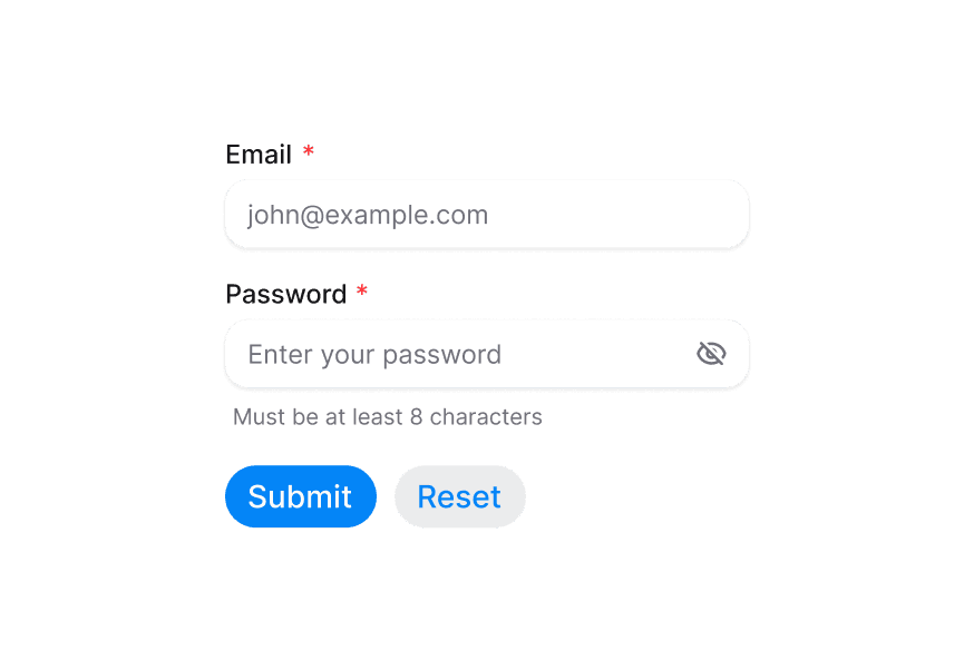
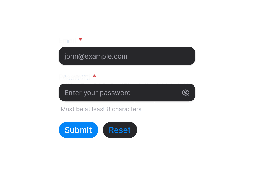
Button
A clickable button component with multiple variants and states
Import
import { Button } from '@heroui/react';Usage
"use client";

import {Button} from "@heroui/react";

export function Basic() {
  return <Button onPress={() => console.log("Button pressed")}>Click me</Button>;
}Variants
import {Button} from "@heroui/react";

export function Variants() {
  return (
<div className="flex flex-wrap gap-3">With Icons
import {Envelope, Globe, Plus, TrashBin} from "@gravity-ui/icons";
import {Button} from "@heroui/react";

export function WithIcons() {
return (Icon Only
import {Ellipsis, Gear, TrashBin} from "@gravity-ui/icons";
import {Button} from "@heroui/react";

export function IconOnly() {
return (Loading
"use client";

import {Button, Spinner} from "@heroui/react";
import React from "react";
Loading State
"use client";

import {Paperclip} from "@gravity-ui/icons";
import {Button, Spinner} from "@heroui/react";
import React, {useState} from "react";Sizes
import {Button} from "@heroui/react";

export function Sizes() {
  return (
<div className="flex items-center gap-3">Full Width
import {Plus} from "@gravity-ui/icons";
import {Button} from "@heroui/react";

export function FullWidth() {
return (Disabled State
import {Button} from "@heroui/react";

export function Disabled() {
  return (
<div className="flex flex-wrap gap-3">Social Buttons
import {Button} from "@heroui/react";
import {Icon} from "@iconify/react";

export function Social() {
return (Custom Render Function
"use client";

import {Button} from "@heroui/react";

export function CustomRenderFunction() {Styling
Passing Tailwind CSS classes
import { Button } from '@heroui/react';

function CustomButton() {
  return (
    <Button className="bg-purple-500 text-white hover:bg-purple-600">
      Purple Button
    </Button>
  );
}
Customizing the component classes
To customize the Button component classes, you can use the @layer components directive.
Learn more.
@layer components {
  .button {
    @apply bg-purple-500 text-white hover:bg-purple-600;
  }

  .button--icon-only {
    @apply rounded-lg bg-blue-500;
  }
}
HeroUI follows the BEM methodology to ensure component variants and states are reusable and easy to customize.
Adding custom variants
You can extend HeroUI components by wrapping them and adding your own custom variants.
import type {ButtonProps} from "@heroui/react";
import type {VariantProps} from "tailwind-variants";

import {Button, buttonVariants} from "@heroui/react";
import {tv} from "tailwind-variants";Adding Ripple Effect
The Button component supports ripple effects through composition, allowing you to nest ripple components as children. This example uses m3-ripple.
"use client";

import {Button} from "@heroui/react";
import {Ripple} from "m3-ripple";
CSS Classes
The Button component uses these CSS classes (View source styles):
Base & Size Classes
.button- Base button styles.button--sm- Small size variant.button--md- Medium size variant.button--lg- Large size variant
Variant Classes
.button--primary.button--secondary.button--tertiary.button--outline.button--ghost.button--danger
Modifier Classes
.button--icon-only.button--icon-only.button--sm.button--icon-only.button--lg
Interactive States
The button supports both CSS pseudo-classes and data attributes for flexibility:
- Hover:
:hoveror[data-hovered="true"] - Active/Pressed:
:activeor[data-pressed="true"](includes scale transform) - Focus:
:focus-visibleor[data-focus-visible="true"](shows focus ring) - Disabled:
:disabledor[aria-disabled="true"](reduced opacity, no pointer events) - Pending:
[data-pending](no pointer events during loading)
API Reference
Button Props
| Prop | Type | Default | Description |
|---|---|---|---|
variant | 'primary' | 'secondary' | 'tertiary' | 'outline' | 'ghost' | 'danger' | 'primary' | Visual style variant |
size | 'sm' | 'md' | 'lg' | 'md' | Size of the button |
fullWidth | boolean | false | Whether the button should take full width of its container |
isDisabled | boolean | false | Whether the button is disabled |
isPending | boolean | false | Whether the button is in a loading state |
isIconOnly | boolean | false | Whether the button contains only an icon |
onPress | (e: PressEvent) => void | - | Handler called when the button is pressed |
children | React.ReactNode | (values: ButtonRenderProps) => React.ReactNode | - | Button content or render prop |
render | DOMRenderFunction<keyof React.JSX.IntrinsicElements, ButtonRenderProps> | - | Overrides the default DOM element with a custom render function. |
ButtonRenderProps
When using the render prop pattern, these values are provided:
| Prop | Type | Description |
|---|---|---|
isPending | boolean | Whether the button is in a loading state |
isPressed | boolean | Whether the button is currently pressed |
isHovered | boolean | Whether the button is hovered |
isFocused | boolean | Whether the button is focused |
isFocusVisible | boolean | Whether the button should show focus indicator |
isDisabled | boolean | Whether the button is disabled |


