All Releases
All updates and changes to HeroUI v3, including new features, fixes, and breaking changes.
Using AI assistants? Simply prompt "Hey Cursor, update HeroUI to the latest version" and your AI assistant will automatically compare versions and apply the necessary changes. Learn more about the HeroUI MCP Server.
Latest Release
v3.0.0-beta.7
February 18, 2026


This release introduces a comprehensive Date & Time system with four new components (Calendar, RangeCalendar, DatePicker, DateRangePicker), new Switch.Content sub-component, explicit Tabs.Separator for opt-in separator lines, and ⚠️ breaking changes removing hideSeparator from Tabs and consolidating DateInputGroup/ColorInputGroup under their respective field components.
v3.0.0-beta.6
February 6, 2026


This release introduces a comprehensive Color System with six new components (ColorPicker, ColorArea, ColorSlider, ColorField, ColorSwatch, ColorSwatchPicker), major Toast improvements with loading states and promise support, Separator variants, and ⚠️ breaking changes renaming Toast.Container to Toast.Provider and updating CSS class names to hyphenated format.
v3.0.0-beta.5
- Fixed build issue
v3.0.0-beta.4
January 20, 2026


Critical Build Issue Fixed: This version (beta.4) had a critical build issue that has been fixed in beta.5. Please upgrade to @heroui/styles@3.0.0-beta.5 and @heroui/react@3.0.0-beta.5 to ensure proper TypeScript declaration generation and export resolution.
This release introduces the new Theme Builder for visual theme customization, three new components (Autocomplete, Breadcrumbs, Toast), secondary variant for Tabs, primary/secondary variants for Input and InputGroup, and ⚠️ breaking changes removing Link's underline variants and isInSurface prop from form components.
v3.0.0-beta.3
December 19, 2025


This release introduces seven new components (ButtonGroup, DateField, ErrorMessage, ScrollShadow, SearchField, TagGroup, TimeField), adds fullWidth support for form and input components, introduces hideSeparator to Tabs, ButtonGroup, and Accordion for cleaner layouts, includes styling fixes, and ⚠️ breaking changes removing the asChild prop and updating AlertDialog & Modal backdrop variant.
v3.0.0-beta.2
November 20, 2025
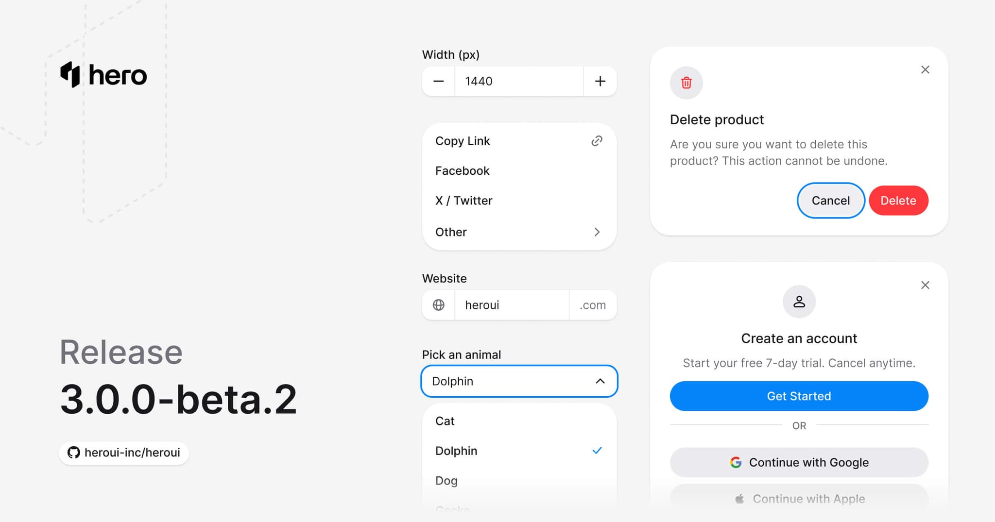
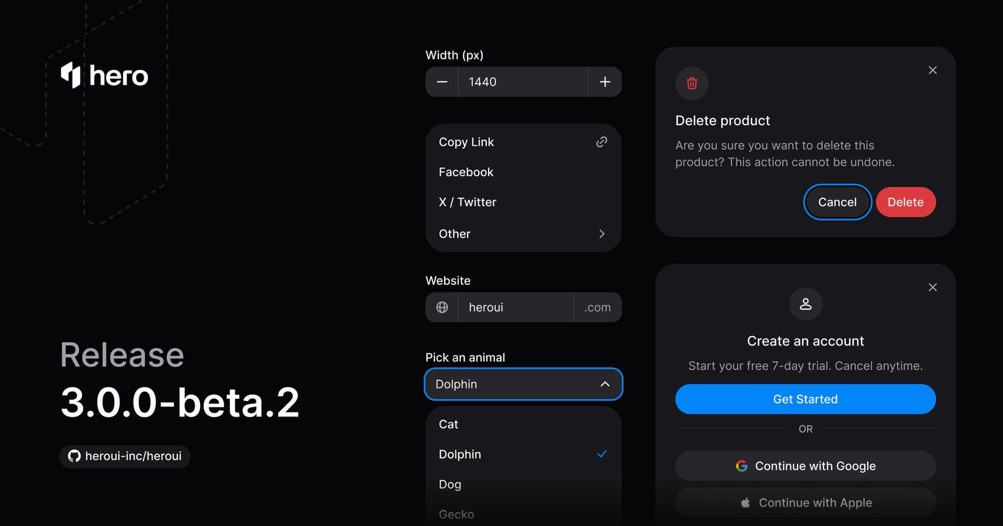
This release introduces six essential new components (AlertDialog, ComboBox, Dropdown, InputGroup, Modal, NumberField), enhances theme compatibility and motion preferences, improves the Select component API with a ⚠️ breaking change, plus various refinements and bug fixes.
v3.0.0-beta.1
November 6, 2025
This release introduces a comprehensive redesign of HeroUI v3, merging v2's beauty and animations with v3's simplicity. All components have been redesigned, 8 new components added (Alert, Checkbox, InputOTP, ListBox, Select, Slider, Surface), and the design system has been completely overhauled with better color tokens, shadows, and architecture. Includes breaking changes to design system variables, component APIs, and flexible component patterns.
Previous Releases
v3.0.0-alpha.35
October 21, 2025
React Server Components Support
- Fixed critical issue where compound components didn't work in React Server Components (RSC)
- Moved compound pattern logic from components to index files, resolving
"use client"conflicts - (⚠️ Breaking change): Main component now requires
.Rootsuffix (e.g.,<Avatar>→<Avatar.Root>) - Named exports remain unchanged and fully supported
React 19 Improvements
Switch Component Refactoring
- (⚠️ Breaking change): Split Switch and SwitchGroup into separate components
- Cleaner API:
<SwitchGroup>replaces<Switch.Group>and<Switch.GroupItems> - Matches Radio/RadioGroup pattern for consistency
- Separate styles, types, and implementations
Affected Components
All compound components now require .Root suffix: Accordion, Avatar, Card, Disclosure, Fieldset, Kbd, Link, Popover, Radio, Switch, Tabs, Tooltip
v3.0.0-alpha.34
October 15, 2025
- Added Form-based components: Description, FieldError, Fieldset, Form, Input, Label, RadioGroup, TextField, and TextArea.
- Introduced form field tokens
--field-* - Reorganized Storybook by category
- (Breaking change): Renamed
--skeleton-default-animation-typeto--skeleton-animationin Skeleton - Aligned data-slot markers across components
- Improved documentation
v3.0.0-alpha.33
October 5, 2025
- Upgraded RAC with October 2, 2025 Release
- Reordered Tabs Indicator (Breaking change)
- Updated Tabs component to use React Aria's
SelectionIndicator, now supports SSR - Updated Disclosure and Disclosure Group components to use RAC CSS variables for the expand and collapse animations
- Updated Switch component styles and animations
- Added
sizevariants and added demo in Switch - Added related showcases in Button, Tabs, Disclosure, Disclosure Group
- Improved documentation
v3.0.0-alpha.32
October 1, 2025
Card component redesigned with new variants, added CloseButton component, MCP Server for AI coding assistants, and improved documentation.
v3.0.0-alpha.31
September 22, 2025
- 🎨 Showcases page - Gallery of sites built with HeroUI
- 🌀 DisclosureGroup component - Groups multiple disclosures together
- 📇 Card component (preview) - First version of card component
- 🔀 Switch component (preview) - Toggle switch for settings
Release Schedule
HeroUI v3 follows a regular release cycle:
- Alpha releases: Weekly to bi-weekly during active development
- Beta releases: Monthly stabilization releases - In progress
- Stable releases: Quarterly major versions (Q4 2025 target)
Contributing
Found an issue or want to contribute? Check out our GitHub repository.