Disclosure
A disclosure is a collapsible section with a header containing a heading and a trigger button, and a panel that wraps the content.
Import
import { Disclosure } from '@heroui/react';Usage
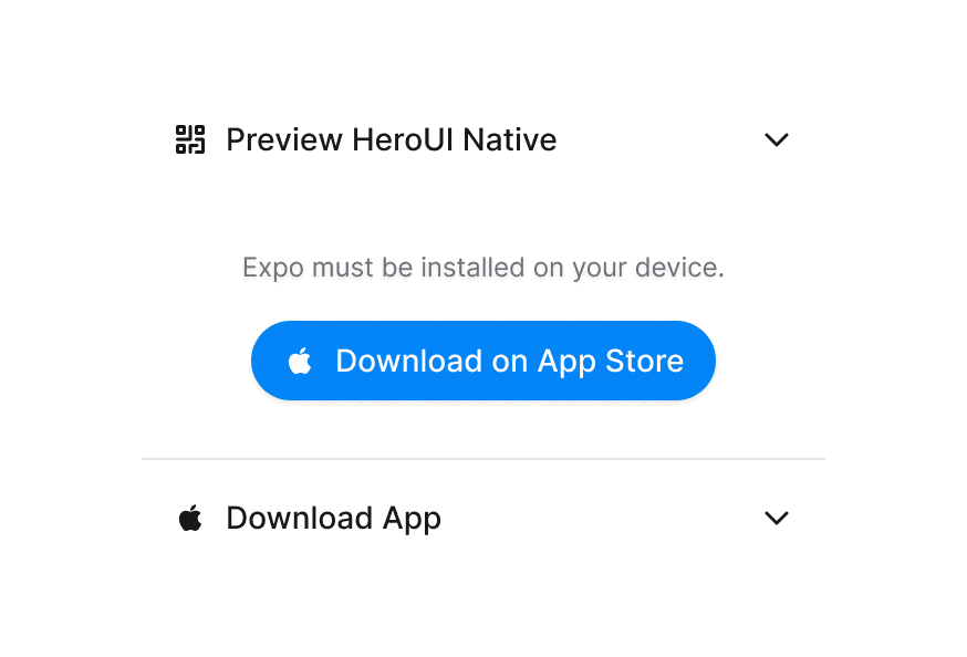
Scan this QR code with your camera app to preview the HeroUI native components.

Expo must be installed on your device.
"use client";

import {QrCode} from "@gravity-ui/icons";
import {Button, Disclosure} from "@heroui/react";
import {Icon} from "@iconify/react";Anatomy
Import the Disclosure component and access all parts using dot notation.
import { Disclosure } from '@heroui/react';

export default () => (
  <Disclosure>
    <Disclosure.Heading>
      <Disclosure.Trigger>
        <Disclosure.Indicator />
      </Disclosure.Trigger>
    </Disclosure.Heading>
    <Disclosure.Content/>
  </Disclosure>
)
Custom Render Function
Scan this QR code with your camera app to preview the HeroUI native components.
Expo must be installed on your device.
"use client";

import {QrCode} from "@gravity-ui/icons";
import {Button, Disclosure} from "@heroui/react";
import {Icon} from "@iconify/react";Styling
Passing Tailwind CSS classes
import { Disclosure } from '@heroui/react';

function CustomDisclosure() {
  return (
    <Disclosure className="border rounded-lg p-4">
      <Disclosure.Heading>
        <Disclosure.Trigger className="text-lg font-semibold">
          Click to expand
          <Disclosure.Indicator />
        </Disclosure.Trigger>
      </Disclosure.Heading>
      <Disclosure.Content>
        <Disclosure.Body className="mt-4 text-gray-600">
          Hidden content
        </Disclosure.Body>
      </Disclosure.Content>
    </Disclosure>
  );
}
Customizing the component classes
To customize the Disclosure component classes, you can use the @layer components directive.
Learn more.
@layer components {
  .disclosure {
    @apply relative;
  }

  .disclosure__trigger {
    @apply cursor-pointer;
  }

  .disclosure__indicator {
    @apply transition-transform duration-300;
  }

  .disclosure__content {
    @apply overflow-hidden transition-all;
  }
}
HeroUI follows the BEM methodology to ensure component variants and states are reusable and easy to customize.
CSS Classes
The Disclosure component uses these CSS classes (View source styles):
Base Classes
.disclosure- Base container styles.disclosure__heading- Heading wrapper.disclosure__trigger- Trigger button styles.disclosure__indicator- Chevron indicator styles.disclosure__content- Content container with animations
Interactive States
The component supports both CSS pseudo-classes and data attributes for flexibility:
- Expanded:
[data-expanded="true"]on indicator for rotation - Focus:
:focus-visibleor[data-focus-visible="true"]on trigger - Disabled:
:disabledor[aria-disabled="true"]on trigger - Hidden:
[aria-hidden="false"]on content for visibility
API Reference
Disclosure Props
| Prop | Type | Default | Description |
|---|---|---|---|
isExpanded | boolean | false | Controls the expanded state |
onExpandedChange | (isExpanded: boolean) => void | - | Callback when expanded state changes |
isDisabled | boolean | false | Whether the disclosure is disabled |
children | ReactNode | RenderFunction | - | Content to render |
className | string | - | Additional CSS classes |
render | DOMRenderFunction<keyof React.JSX.IntrinsicElements, DisclosureRenderProps> | - | Overrides the default DOM element with a custom render function. |
DisclosureTrigger Props
| Prop | Type | Default | Description |
|---|---|---|---|
children | ReactNode | RenderFunction | - | Trigger content |
className | string | - | Additional CSS classes |
DisclosureContent Props
| Prop | Type | Default | Description |
|---|---|---|---|
children | ReactNode | - | Content to show/hide |
className | string | - | Additional CSS classes |
render | DOMRenderFunction<keyof React.JSX.IntrinsicElements, DisclosureContentRenderProps> | - | Overrides the default DOM element with a custom render function. |
RenderProps
When using the render prop pattern, these values are provided:
| Prop | Type | Description |
|---|---|---|
isExpanded | boolean | Current expanded state |
isDisabled | boolean | Whether disclosure is disabled |