Card
Flexible container component for grouping related content and actions
Import
import { Card } from "@heroui/react";Usage
Become an Acme Creator!
Visit the Acme Creator Hub to sign up today and start earning credits from your fans and followers.
import {CircleDollar} from "@gravity-ui/icons";
import {Card, Link} from "@heroui/react";

export function Default() {
return (Anatomy
Import the Card component and access all parts using dot notation.
import { Card } from "@heroui/react";

export default () => (
  <Card>
    <Card.Header>
      <Card.Title />
      <Card.Description />
    </Card.Header>
    <Card.Content />
    <Card.Footer />
  </Card>
);
Variants
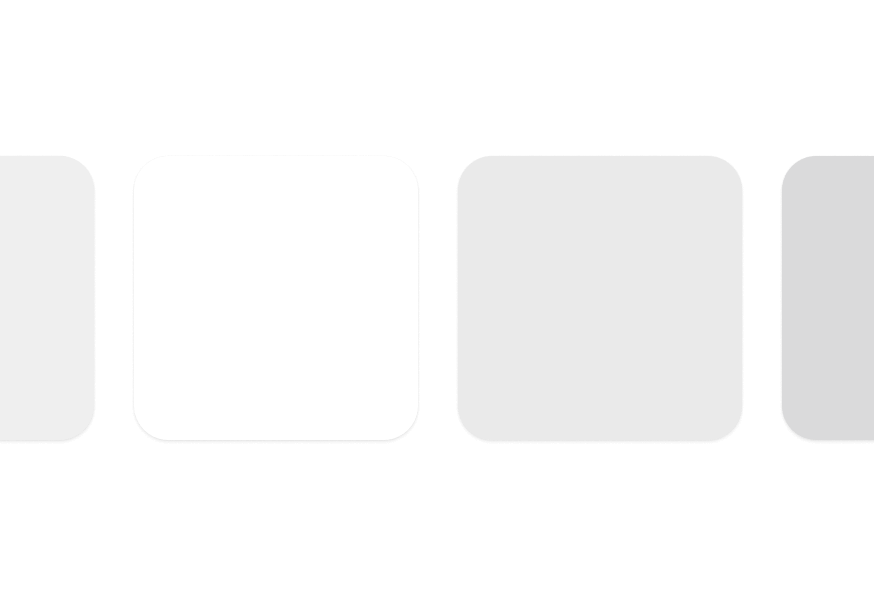
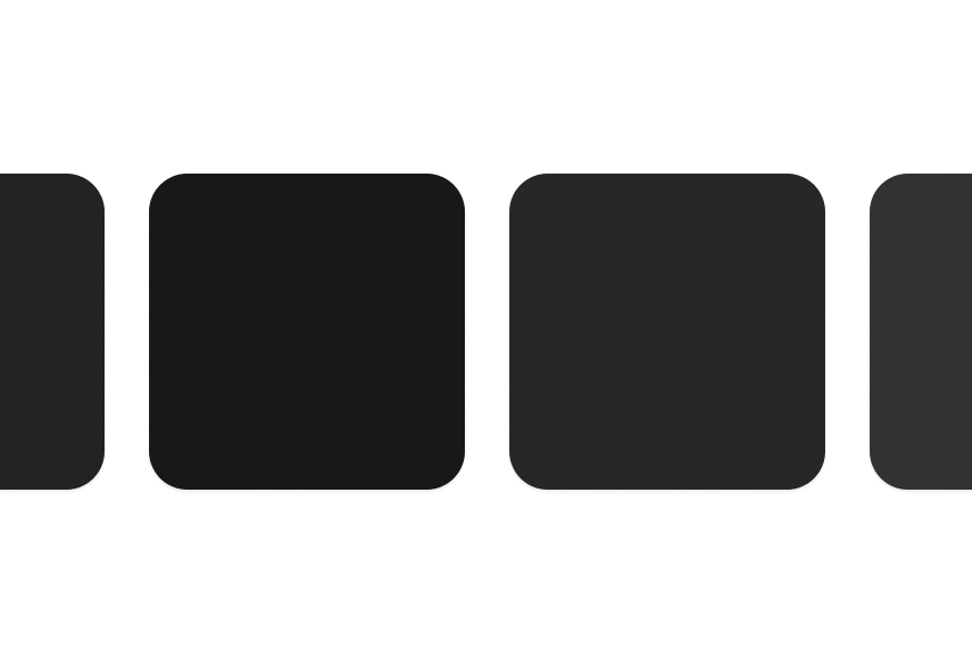
Cards come in semantic variants that describe their prominence level rather than specific visual styles. This allows themes to interpret them differently:
Transparent
Minimal prominence with transparent background
Use for less important content or nested cards
Default
Standard card appearance (bg-surface)
The default card variant for most use cases
Secondary
Medium prominence (bg-surface-secondary)
Use to draw moderate attention
Tertiary
Higher prominence (bg-surface-tertiary)
Use for primary or featured content
import {Card} from "@heroui/react";

export function Variants() {
  return (
<div className="flex flex-col gap-4">transparent- Minimal prominence, transparent background (great for nested cards)default- Standard card for most use cases (surface-secondary)secondary- Medium prominence to draw moderate attention (surface-tertiary)tertiary- Higher prominence for important content (surface-tertiary)
Horizontal Layout

Become an ACME Creator!
Lorem ipsum dolor sit amet consectetur. Sed arcu donec id aliquam dolor sed amet faucibus etiam.
import {Button, Card, CloseButton} from "@heroui/react";

export function Horizontal() {
  return (
<Card className="w-full items-stretch md:flex-row">With Avatar

Indie Hackers
148 members

AI Builders
362 members
import {Avatar, Card} from "@heroui/react";

export function WithAvatar() {
  return (
<div className="flex flex-wrap gap-4">With Images
Become an ACME Creator!
Lorem ipsum dolor sit amet consectetur. Sed arcu donec id aliquam dolor sed amet faucibus etiam.
You can now withdraw on crypto
Add your wallet in settings to withdraw
Indie Hackers
148 members
AI Builders
362 members
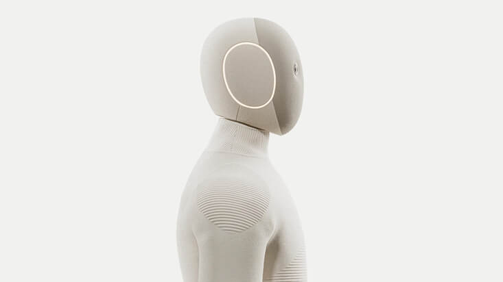
NEO
Home Robot


Bridging the Future
Today, 6:30 PM

Avocado Hackathon
Wed, 4:30 PM

Sound Electro | Beyond art
Fri, 8:00 PM
import {CircleDollar} from "@gravity-ui/icons";
import {Avatar, Button, Card, CloseButton, Link} from "@heroui/react";

export function WithImages() {
return (With Form
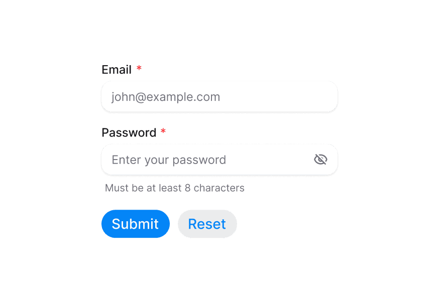
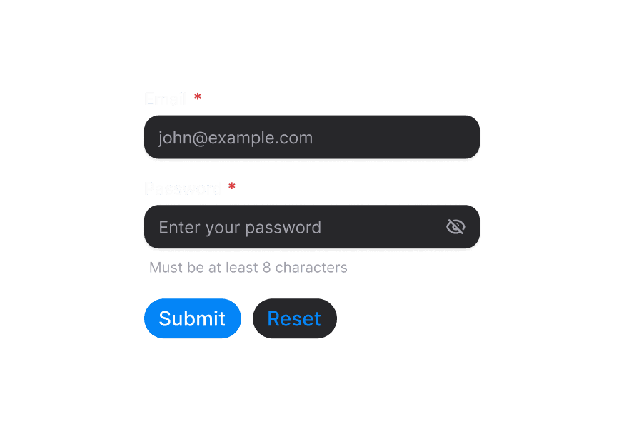
Login
Enter your credentials to access your account
"use client";

import {Button, Card, Form, Input, Label, Link, TextField} from "@heroui/react";

export function WithForm() {Accessibility
import { Card } from '@heroui/react';
import { cardVariants } from '@heroui/styles';

// Semantic markup
<Card role="article" aria-labelledby="card-title">
  <Card.Header>
    <Card.Title id="card-title">Article Title</Card.Title>
  </Card.Header>
</Card>

// Interactive cards
<a className={cardVariants().base()} href="/details" aria-label="View product details">
  <Card.Title>Product Name</Card.Title>
</a>
Styling
Component Customization
<Card className="border-2 border-blue-500 bg-gradient-to-r from-blue-50 to-purple-50">
  <Card.Header>
    <Card.Title className="text-blue-900">Custom Styled Card</Card.Title>
    <Card.Description className="text-blue-700">Custom colors applied</Card.Description>
  </Card.Header>
  <Card.Content>
    <p className="text-blue-800">Content with custom styling</p>
  </Card.Content>
</Card>
CSS Variable Overrides
/* Override specific variants */
.card--secondary {
  @apply bg-gradient-to-br from-blue-50 to-purple-50;
}

/* Custom element styles */
.card__title {
  @apply text-xl font-bold;
}
CSS Classes
Card uses BEM naming for predictable styling, (View source styles):
Base Classes
.card- Base container with padding and border.card__header- Header section container.card__title- Title with base font size and weight.card__description- Muted description text.card__content- Flexible content container.card__footer- Footer with row layout
Variant Classes
.card--transparent- Minimal prominence, transparent background (maps totransparentvariant).card--default- Standard appearance with surface-secondary (default).card--secondary- Medium prominence with surface-tertiary (maps tosecondaryvariant).card--tertiary- Higher prominence with surface-tertiary (maps totertiaryvariant)
API Reference
Card
| Prop | Type | Default | Description |
|---|---|---|---|
variant | "transparent" | "default" | "secondary" | "tertiary" | "default" | Semantic variant indicating prominence level |
className | string | - | Additional CSS classes |
children | React.ReactNode | - | Card content |
Card.Header
| Prop | Type | Default | Description |
|---|---|---|---|
className | string | - | Additional CSS classes |
children | React.ReactNode | - | Header content |
Card.Title
| Prop | Type | Default | Description |
|---|---|---|---|
className | string | - | Additional CSS classes |
children | React.ReactNode | - | Title content (renders as h3) |
Card.Description
| Prop | Type | Default | Description |
|---|---|---|---|
className | string | - | Additional CSS classes |
children | React.ReactNode | - | Description content (renders as p) |
Card.Content
| Prop | Type | Default | Description |
|---|---|---|---|
className | string | - | Additional CSS classes |
children | React.ReactNode | - | Main content |
Card.Footer
| Prop | Type | Default | Description |
|---|---|---|---|
className | string | - | Additional CSS classes |
children | React.ReactNode | - | Footer content |