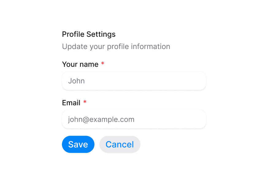
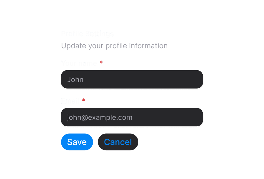
Form
Wrapper component for form validation and submission handling
Import
import { Form } from '@heroui/react';Usage
"use client";

import {Check} from "@gravity-ui/icons";
import {Button, Description, FieldError, Form, Input, Label, TextField} from "@heroui/react";
Anatomy
Import all parts and piece them together.
import {Form, Button} from '@heroui/react';

export default () => (
  <Form>
    {/* Form fields go here */}
    <Button type="submit"/>
    <Button type="reset"/>
  </Form>
)
Custom Render Function
"use client";

import {Check} from "@gravity-ui/icons";
import {Button, Description, FieldError, Form, Input, Label, TextField} from "@heroui/react";
Styling
Passing Tailwind CSS classes
import {Form, TextField, Label, Input, FieldError, Button} from '@heroui/react';

function CustomForm() {
  return (
    <Form className="w-full max-w-md space-y-4 rounded-lg border border-border bg-surface p-6">
      <TextField>
        <Label className="text-sm font-medium">Email</Label>
        <Input className="rounded-full border-border/60" placeholder="Enter your email" />
        <FieldError className="text-xs" />
      </TextField>
      <Button type="submit" className="w-full">
        Submit
      </Button>
    </Form>
  );
}
API Reference
Form Props
The Form component is a wrapper around React Aria's Form primitive that provides form validation and submission handling capabilities.
| Prop | Type | Default | Description |
|---|---|---|---|
action | string | FormHTMLAttributes['action'] | - | The URL to submit the form data to. |
className | string | - | Tailwind CSS classes applied to the form element. |
children | React.ReactNode | - | Form content (fields, buttons, etc.). |
encType | 'application/x-www-form-urlencoded' | 'multipart/form-data' | 'text/plain' | - | The encoding type for form data submission. |
method | 'get' | 'post' | - | The HTTP method to use when submitting the form. |
onInvalid | (event: FormEvent<HTMLFormElement>) => void | - | Handler called when the form validation fails. By default, the first invalid field will be focused. Use preventDefault() to customize focus behavior. |
onReset | (event: FormEvent<HTMLFormElement>) => void | - | Handler called when the form is reset. |
onSubmit | (event: FormEvent<HTMLFormElement>) => void | - | Handler called when the form is submitted. |
target | '_self' | '_blank' | '_parent' | '_top' | - | Where to display the response after submitting the form. |
validationBehavior | 'native' | 'aria' | 'native' | Whether to use native HTML validation or ARIA validation. 'native' blocks form submission, 'aria' displays errors in realtime. |
validationErrors | ValidationErrors | - | Server-side validation errors mapped by field name. Displayed immediately and cleared when user modifies the field. |
aria-label | string | - | Accessibility label for the form. |
aria-labelledby | string | - | ID of element that labels the form. Creates a form landmark when provided. |
render | DOMRenderFunction<keyof React.JSX.IntrinsicElements, undefined> | - | Overrides the default DOM element with a custom render function. |
Form Validation
The Form component integrates with React Aria's validation system, allowing you to:
- Use built-in HTML5 validation attributes (
required,minLength,pattern, etc.) - Provide custom validation functions on TextField components
- Display validation errors with FieldError components
- Handle form submission with proper validation
- Provide server-side validation errors via
validationErrorsprop
Validation Behavior
The validationBehavior prop controls how validation is displayed:
native(default): Uses native HTML validation, blocks form submission on errorsaria: Uses ARIA attributes for validation, displays errors in realtime as user types, doesn't block submission
This behavior can be set at the form level or overridden at individual field level.
Form Submission
Forms can be submitted in several ways:
- Traditional submission: Set the
actionprop to submit to a URL - JavaScript handling: Use the
onSubmithandler to process form data - FormData API: Access form data using the FormData API in your submit handler
Example with FormData:
function handleSubmit(e: FormEvent<HTMLFormElement>) {
  e.preventDefault();
  const formData = new FormData(e.currentTarget);
  const data = Object.fromEntries(formData);
  console.log('Form data:', data);
}
Integration with Form Fields
The Form component works seamlessly with HeroUI's form field components:
- TextField: For text inputs with labels and validation
- Checkbox: For boolean selections
- RadioGroup: For single selection from multiple options
- Switch: For toggle controls
- Button: For form submission and reset actions
All field components automatically integrate with the Form's validation and submission behavior when placed inside it.
Accessibility
Forms are accessible by default when using React Aria components. Key features include:
- Native
<form>element semantics - Form landmark creation with
aria-labeloraria-labelledby - Automatic focus management on validation errors
- ARIA validation attributes when using
validationBehavior="aria"
Advanced Usage
For more advanced use cases including:
- Custom validation context
- Form context providers
- Integration with third-party libraries
- Custom focus management on validation errors
Please refer to the React Aria Form documentation.


