Composable date range picker with month grid, navigation, and year picker support built on React Aria RangeCalendar
import { RangeCalendar } from '@heroui/react' ;
Trip dates, February 2026 26
27
28
29
30
31
1
2
3
4
5
6
7
8
9
10
11
12
13
14
15
16
17
18
19
20
21
22
23
24
25
26
27
28
1
"use client" ; import {RangeCalendar} from "@heroui/react" ; export function Basic () { Expand code import {RangeCalendar} from '@heroui/react' ; export default () => ( < RangeCalendar aria-label = "Trip dates" > < RangeCalendar.Header > < RangeCalendar.Heading /> < RangeCalendar.NavButton slot = "previous" /> < RangeCalendar.NavButton slot = "next" /> </ RangeCalendar.Header > < RangeCalendar.Grid > < RangeCalendar.GridHeader > {( day ) => < RangeCalendar.HeaderCell >{day}</ RangeCalendar.HeaderCell >} </ RangeCalendar.GridHeader > < RangeCalendar.GridBody > {( date ) => < RangeCalendar.Cell date = {date} />} </ RangeCalendar.GridBody > </ RangeCalendar.Grid > </ RangeCalendar > ) RangeCalendar.YearPickerTrigger, RangeCalendar.YearPickerGrid, and their body/cell subcomponents provide an integrated year navigation pattern.
Trip dates, February 2026 1
2
3
4
5
6
7
8
9
10
11
12
13
14
15
16
17
18
19
20
21
22
23
24
25
26
27
28
1900 1901 1902 1903 1904 1905 1906 1907 1908 1909 1910 1911 1912 1913 1914 1915 1916 1917 1918 1919 1920 1921 1922 1923 1924 1925 1926 1927 1928 1929 1930 1931 1932 1933 1934 1935 1936 1937 1938 1939 1940 1941 1942 1943 1944 1945 1946 1947 1948 1949 1950 1951 1952 1953 1954 1955 1956 1957 1958 1959 1960 1961 1962 1963 1964 1965 1966 1967 1968 1969 1970 1971 1972 1973 1974 1975 1976 1977 1978 1979 1980 1981 1982 1983 1984 1985 1986 1987 1988 1989 1990 1991 1992 1993 1994 1995 1996 1997 1998 1999 2000 2001 2002 2003 2004 2005 2006 2007 2008 2009 2010 2011 2012 2013 2014 2015 2016 2017 2018 2019 2020 2021 2022 2023 2024 2025 2026 2027 2028 2029 2030 2031 2032 2033 2034 2035 2036 2037 2038 2039 2040 2041 2042 2043 2044 2045 2046 2047 2048 2049 2050 2051 2052 2053 2054 2055 2056 2057 2058 2059 2060 2061 2062 2063 2064 2065 2066 2067 2068 2069 2070 2071 2072 2073 2074 2075 2076 2077 2078 2079 2080 2081 2082 2083 2084 2085 2086 2087 2088 2089 2090 2091 2092 2093 2094 2095 2096 2097 2098 2099
"use client" ; import {RangeCalendar} from "@heroui/react" ; export function YearPicker () { Expand code
Trip dates, February 2025 27
28
29
30
31
1
2
3
4
5
6
7
8
9
10
11
12
13
14
15
16
17
18
19
20
21
22
23
24
25
26
27
28
1
2
"use client" ; import {RangeCalendar} from "@heroui/react" ; import {parseDate} from "@internationalized/date" ; Expand code This week Next week Next month
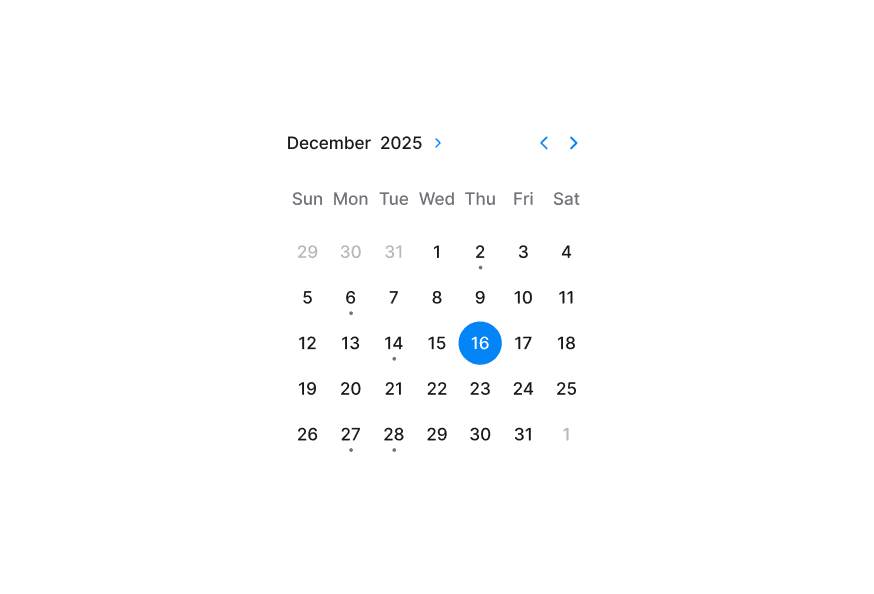
Trip dates, December 2025 1
2
3
4
5
6
7
8
9
10
11
12
13
14
15
16
17
18
19
20
21
22
23
24
25
26
27
28
29
30
31
1
2
3
4
Selected range: (none) Set 1 week Set Holidays Clear
"use client" ; import type {DateValue} from "@internationalized/date" ; import {Button, ButtonGroup, Description, RangeCalendar} from "@heroui/react" ; Expand code
Trip dates, February 2026 1
2
3
4
5
6
7
8
9
10
11
12
13
14
15
16
17
18
19
20
21
22
23
24
25
26
27
28
Select dates between today and 2026-05-19 "use client" ; import {Description, RangeCalendar} from "@heroui/react" ; import {getLocalTimeZone, today} from "@internationalized/date" ; Expand code Use isDateUnavailable to block dates such as weekends, holidays, or booked slots.
Trip dates, February 2026 26
27
28
29
30
31
1
2
3
4
5
6
7
8
9
10
11
12
13
14
15
16
17
18
19
20
21
22
23
24
25
26
27
28
1
Some days are unavailable "use client" ; import type {DateValue} from "@internationalized/date" ; import {Description, RangeCalendar} from "@heroui/react" ; Expand code Enable allowsNonContiguousRanges to allow selection across unavailable dates.
Trip dates, February 2026 26
27
28
29
30
31
1
2
3
4
5
6
7
8
9
10
11
12
13
14
15
16
17
18
19
20
21
22
23
24
25
26
27
28
1
Non-contiguous ranges are allowed across unavailable dates "use client" ; import type {DateValue} from "@internationalized/date" ; import {Description, RangeCalendar} from "@heroui/react" ; Expand code
Trip dates, February 2026 1
2
3
4
5
6
7
8
9
10
11
12
13
14
15
16
17
18
19
20
21
22
23
24
25
26
27
28
Range calendar is disabled "use client" ; import {Description, RangeCalendar} from "@heroui/react" ; export function Disabled () { Expand code
Trip dates, February 2026 1
2
3
4
5
6
7
8
9
10
11
12
13
14
15
16
17
18
19
20
21
22
23
24
25
26
27
28
Range calendar is read-only "use client" ; import {Description, RangeCalendar} from "@heroui/react" ; import {getLocalTimeZone, today} from "@internationalized/date" ; Expand code
Trip dates, February 2026 26
27
28
29
30
31
1
2
3
4
5
6
7
8
9
10
11
12
13
14
15
16
17
18
19
20
21
22
23
24
25
26
27
28
1
Maximum stay duration is 1 week
"use client" ; import type {DateValue} from "@internationalized/date" ; import {Description, RangeCalendar} from "@heroui/react" ; Expand code
Trip dates, June 2025 26
27
28
29
30
31
1
2
3
4
5
6
7
8
9
10
11
12
13
14
15
16
17
18
19
20
21
22
23
24
25
26
27
28
29
30
1
2
3
4
5
6
Focused: 2025-06-15 Go to Jan Go to Jun Go to Christmas
"use client" ; import type {DateValue} from "@internationalized/date" ; import {Button, Description, RangeCalendar} from "@heroui/react" ; Expand code You can customize RangeCalendar.Cell children and use RangeCalendar.CellIndicator to display metadata like events.
Trip dates, February 2026 1
2
3
4
5
6
7
8
9
10
11
12
13
14
15
16
17
18
19
20
21
22
23
24
25
26
27
28
"use client" ; import {RangeCalendar} from "@heroui/react" ; import {getLocalTimeZone, isToday} from "@internationalized/date" ; Expand code Render multiple grids with visibleDuration and offset for booking and planning experiences.
Trip dates, February to March 2026 February – March 2026 1
2
3
4
5
6
7
8
9
10
11
12
13
14
15
16
17
18
19
20
21
22
23
24
25
26
27
28
1
2
3
4
5
6
7
8
9
10
11
12
13
14
15
16
17
18
19
20
21
22
23
24
25
26
27
28
29
30
31
1
2
3
4
"use client" ; import {RangeCalendar} from "@heroui/react" ; import {getLocalTimeZone} from "@internationalized/date" ; import React from "react" ; Expand code By default, RangeCalendar displays dates using the calendar system for the user's locale. You can override this by wrapping your RangeCalendar with I18nProvider and setting the Unicode calendar locale extension .
The example below shows the Indian calendar system:
Trip dates, शक 1947 माघ 28
29
30
1
2
3
4
5
6
7
8
9
10
11
12
13
14
15
16
17
18
19
20
21
22
23
24
25
26
27
28
29
30
1
2
1822 शक 1823 शक 1824 शक 1825 शक 1826 शक 1827 शक 1828 शक 1829 शक 1830 शक 1831 शक 1832 शक 1833 शक 1834 शक 1835 शक 1836 शक 1837 शक 1838 शक 1839 शक 1840 शक 1841 शक 1842 शक 1843 शक 1844 शक 1845 शक 1846 शक 1847 शक 1848 शक 1849 शक 1850 शक 1851 शक 1852 शक 1853 शक 1854 शक 1855 शक 1856 शक 1857 शक 1858 शक 1859 शक 1860 शक 1861 शक 1862 शक 1863 शक 1864 शक 1865 शक 1866 शक 1867 शक 1868 शक 1869 शक 1870 शक 1871 शक 1872 शक 1873 शक 1874 शक 1875 शक 1876 शक 1877 शक 1878 शक 1879 शक 1880 शक 1881 शक 1882 शक 1883 शक 1884 शक 1885 शक 1886 शक 1887 शक 1888 शक 1889 शक 1890 शक 1891 शक 1892 शक 1893 शक 1894 शक 1895 शक 1896 शक 1897 शक 1898 शक 1899 शक 1900 शक 1901 शक 1902 शक 1903 शक 1904 शक 1905 शक 1906 शक 1907 शक 1908 शक 1909 शक 1910 शक 1911 शक 1912 शक 1913 शक 1914 शक 1915 शक 1916 शक 1917 शक 1918 शक 1919 शक 1920 शक 1921 शक 1922 शक 1923 शक 1924 शक 1925 शक 1926 शक 1927 शक 1928 शक 1929 शक 1930 शक 1931 शक 1932 शक 1933 शक 1934 शक 1935 शक 1936 शक 1937 शक 1938 शक 1939 शक 1940 शक 1941 शक 1942 शक 1943 शक 1944 शक 1945 शक 1946 शक 1947 शक 1948 शक 1949 शक 1950 शक 1951 शक 1952 शक 1953 शक 1954 शक 1955 शक 1956 शक 1957 शक 1958 शक 1959 शक 1960 शक 1961 शक 1962 शक 1963 शक 1964 शक 1965 शक 1966 शक 1967 शक 1968 शक 1969 शक 1970 शक 1971 शक 1972 शक 1973 शक 1974 शक 1975 शक 1976 शक 1977 शक 1978 शक 1979 शक 1980 शक 1981 शक 1982 शक 1983 शक 1984 शक 1985 शक 1986 शक 1987 शक 1988 शक 1989 शक 1990 शक 1991 शक 1992 शक 1993 शक 1994 शक 1995 शक 1996 शक 1997 शक 1998 शक 1999 शक 2000 शक 2001 शक 2002 शक 2003 शक 2004 शक 2005 शक 2006 शक 2007 शक 2008 शक 2009 शक 2010 शक 2011 शक 2012 शक 2013 शक 2014 शक 2015 शक 2016 शक 2017 शक 2018 शक 2019 शक 2020 शक 2021 शक
"use client" ; import {RangeCalendar} from "@heroui/react" ; import {I18nProvider} from "react-aria-components" ; Expand code Note: The onChange event always returns a date in the same calendar system as the value or defaultValue (Gregorian if no value is provided), regardless of the displayed locale.
Booking range, February 2026 1
2
3
4
5
6
7
8
9
10
11
12
13
14
15
16
17
18
19
20
21
22
23
24
25
26
27
28
"use client" ; import type {DateValue} from "@internationalized/date" ; import {Button, RangeCalendar} from "@heroui/react" ; Expand code import {RangeCalendar} from '@heroui/react' ; function CustomRangeCalendar () { return ( < RangeCalendar aria-label = "Trip dates" className = "w-80 rounded-2xl border border-border bg-surface p-3 shadow-sm" > < RangeCalendar.Header className = "pb-3" > < RangeCalendar.Heading className = "text-default" /> < RangeCalendar.NavButton slot = "previous" className = "text-default" /> < RangeCalendar.NavButton slot = "next" className = "text-default" /> </ RangeCalendar.Header > < RangeCalendar.Grid > < RangeCalendar.GridHeader > {( day ) => < RangeCalendar.HeaderCell >{day}</ RangeCalendar.HeaderCell >} </ RangeCalendar.GridHeader > < RangeCalendar.GridBody > {( date ) => < RangeCalendar.Cell date = {date} />} </ RangeCalendar.GridBody > </ RangeCalendar.Grid > </ RangeCalendar > ); } @layer components { .range-calendar { @ apply w- 80 rounded- 2 xl border border-border bg-surface p- 3 shadow-sm ; } .range-calendar__heading { @ apply text-sm font-semibold text-default ; } .range-calendar__cell [ data-selected = "true" ] .range-calendar__cell-button { @ apply bg-accent text-accent-foreground ; } } RangeCalendar uses these classes in packages/styles/components/range-calendar.css and packages/styles/components/calendar-year-picker.css:
.range-calendar - Root container..range-calendar__header - Header row containing nav buttons and heading..range-calendar__heading - Current month label..range-calendar__nav-button - Previous/next navigation controls..range-calendar__grid - Main day grid..range-calendar__grid-header - Weekday header row wrapper..range-calendar__grid-body - Date rows wrapper..range-calendar__header-cell - Weekday header cell..range-calendar__cell - Interactive day cell wrapper..range-calendar__cell-button - Interactive day button inside each cell..range-calendar__cell-indicator - Dot indicator inside a day cell..calendar-year-picker__trigger - Year picker toggle button..calendar-year-picker__trigger-heading - Heading text inside year picker trigger..calendar-year-picker__trigger-indicator - Indicator icon inside year picker trigger..calendar-year-picker__year-grid - Overlay grid of selectable years..calendar-year-picker__year-cell - Individual year option.
RangeCalendar supports both pseudo-classes and React Aria data attributes:
Selected : [data-selected="true"]Selection start : [data-selection-start="true"]Selection end : [data-selection-end="true"]Range middle : [data-selection-in-range="true"]Today : [data-today="true"]Unavailable : [data-unavailable="true"]Outside month : [data-outside-month="true"]Hovered : :hover or [data-hovered="true"]Pressed : :active or [data-pressed="true"]Focus visible : :focus-visible or [data-focus-visible="true"]Disabled : :disabled or [data-disabled="true"]
RangeCalendar inherits all props from React Aria RangeCalendar .
Prop Type Default Description valueRangeValue<DateValue> | null- Controlled selected range. defaultValueRangeValue<DateValue> | null- Initial selected range (uncontrolled). onChange(value: RangeValue<DateValue>) => void- Called when selection changes. focusedValueDateValue- Controlled focused date. onFocusChange(value: DateValue) => void- Called when focus moves to another date. minValueDateValueCalendar-aware 1900-01-01 Earliest selectable date. maxValueDateValueCalendar-aware 2099-12-31 Latest selectable date. isDateUnavailable(date: DateValue) => boolean- Marks dates as unavailable. allowsNonContiguousRangesbooleanfalseAllows ranges that span unavailable dates. isDisabledbooleanfalseDisables interaction and selection. isReadOnlybooleanfalseKeeps content readable but prevents selection changes. isInvalidbooleanfalseMarks the calendar as invalid for validation UI. visibleDuration{months?: number}{months: 1}Number of visible months. defaultYearPickerOpenbooleanfalseInitial open state of internal year picker. isYearPickerOpenboolean- Controlled year picker open state. onYearPickerOpenChange(isOpen: boolean) => void- Called when year picker open state changes.
Component Description RangeCalendar.HeaderHeader container for navigation and heading. RangeCalendar.HeadingCurrent month/year heading. RangeCalendar.NavButtonPrevious/next navigation control (slot="previous" or slot="next"). RangeCalendar.GridDay grid for one month (offset supported for multi-month layouts). RangeCalendar.GridHeaderWeekday header container. RangeCalendar.GridBodyDate cell body container. RangeCalendar.HeaderCellWeekday label cell. RangeCalendar.CellIndividual date cell. RangeCalendar.CellIndicatorOptional indicator element for custom metadata. RangeCalendar.YearPickerTriggerTrigger to toggle year-picker mode. RangeCalendar.YearPickerTriggerHeadingLocalized heading content inside the year-picker trigger. RangeCalendar.YearPickerTriggerIndicatorToggle icon inside the year-picker trigger. RangeCalendar.YearPickerGridOverlay year selection grid container. RangeCalendar.YearPickerGridBodyBody renderer for year grid cells. RangeCalendar.YearPickerCellIndividual year option cell.
When RangeCalendar.Cell children is a function, React Aria render props are available:
Prop Type Description formattedDatestringLocalized day label for the cell. isSelectedbooleanWhether the date is selected. isSelectionStartbooleanWhether the date is the start of the selected range. isSelectionEndbooleanWhether the date is the end of the selected range. isUnavailablebooleanWhether the date is unavailable. isDisabledbooleanWhether the cell is disabled. isOutsideMonthbooleanWhether the date belongs to adjacent month.
For a complete list of supported calendar systems and their identifiers, see:
@internationalized/dateCalendarDate, CalendarDateTime, ZonedDateTime) and utilities used by all date componentsI18nProvideruseLocale