TagGroup
A focusable list of tags with support for keyboard navigation, selection, and removal
Import
import { TagGroup } from '@heroui/react';Usage
"use client";

import {PlanetEarth, Rocket, ShoppingBag, SquareArticle} from "@gravity-ui/icons";
import {Tag, TagGroup} from "@heroui/react";
Anatomy
import { TagGroup, Tag, Label, Description, ErrorMessage } from '@heroui/react';

export default () => (
  <TagGroup>
    <Label />
    <TagGroup.List>
      <Tag>
        <Tag.RemoveButton />
      </Tag>
    </TagGroup.List>
    <Description />
    <ErrorMessage />
  </TagGroup>
)
Sizes
"use client";

import {Label, Tag, TagGroup} from "@heroui/react";

export function TagGroupSizes() {Variants
"use client";

import {Label, Tag, TagGroup} from "@heroui/react";

export function TagGroupVariants() {Disabled
"use client";

import {Description, Label, Tag, TagGroup} from "@heroui/react";

export function TagGroupDisabled() {Selection Modes
"use client";

import type {Key} from "@heroui/react";

import {Description, Label, Tag, TagGroup} from "@heroui/react";Controlled
"use client";

import type {Key} from "@heroui/react";
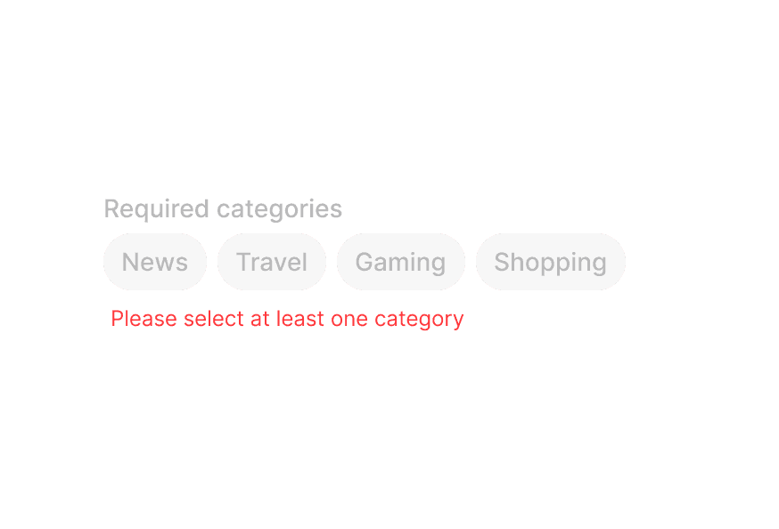
import {Description, Label, Tag, TagGroup} from "@heroui/react";With Error Message
"use client";

import type {Key} from "@heroui/react";

import {Description, ErrorMessage, Label, Tag, TagGroup} from "@heroui/react";With Prefix
"use client";

import {PlanetEarth, Rocket, ShoppingBag, SquareArticle} from "@gravity-ui/icons";
import {Avatar, Description, Label, Tag, TagGroup} from "@heroui/react";
With Remove Button
"use client";

import type {Key} from "@heroui/react";

import {CircleXmarkFill} from "@gravity-ui/icons";With List Data
Selected:
"use client";

import type {Key} from "@heroui/react";

import {Avatar, Description, EmptyState, Label, Tag, TagGroup, useListData} from "@heroui/react";Custom Render Function
"use client";

import {PlanetEarth, Rocket, ShoppingBag, SquareArticle} from "@gravity-ui/icons";
import {Tag, TagGroup} from "@heroui/react";
Styling
Passing Tailwind CSS classes
import { TagGroup, Tag, Label } from '@heroui/react';

function CustomTagGroup() {
  return (
    <TagGroup className="w-full">
      <Label>Categories</Label>
      <TagGroup.List className="gap-2">
        <Tag className="rounded-lg px-4 py-2 font-bold">
          Custom Styled
        </Tag>
      </TagGroup.List>
    </TagGroup>
  );
}
Customizing the component classes
To customize the TagGroup component classes, you can use the @layer components directive.
Learn more.
@layer components {
  .tag-group {
    @apply flex flex-col gap-2;
  }

  .tag-group__list {
    @apply flex flex-wrap gap-2;
  }

  .tag {
    @apply rounded-full px-3 py-1;
  }

  .tag__remove-button {
    @apply ml-1;
  }
}
HeroUI follows the BEM methodology to ensure component variants and states are reusable and easy to customize.
CSS Classes
The TagGroup component uses these CSS classes (View source styles and tag.css):
Base Classes
.tag-group- Base tag group container.tag-group__list- Container for the list of tags.tag- Base tag styles.tag__remove-button- Remove button trigger
Slot Classes
.tag-group [slot="description"]- Description slot styles.tag-group [slot="errorMessage"]- ErrorMessage slot styles
Size Classes
.tag--sm- Small size tag.tag--md- Medium size tag (default).tag--lg- Large size tag
Variant Classes
.tag--default- Default variant.tag--surface- Surface variant with surface background
State Classes
.tag[data-selected="true"]- Selected tag state.tag[data-disabled="true"]- Disabled tag state.tag[data-hovered="true"]- Hovered tag state.tag[data-pressed="true"]- Pressed tag state.tag[data-focus-visible="true"]- Focused tag state (keyboard focus)
Interactive States
The component supports both CSS pseudo-classes and data attributes for flexibility:
- Hover:
:hoveror[data-hovered="true"]on tag - Focus:
:focus-visibleor[data-focus-visible="true"]on tag - Pressed:
:activeor[data-pressed="true"]on tag - Selected:
[data-selected="true"]or[aria-selected="true"]on tag - Disabled:
:disabledor[data-disabled="true"]on tag
API Reference
TagGroup Props
| Prop | Type | Default | Description |
|---|---|---|---|
selectionMode | "none" | "single" | "multiple" | "none" | The type of selection that is allowed |
selectedKeys | Selection | - | The currently selected keys (controlled) |
defaultSelectedKeys | Selection | - | The initial selected keys (uncontrolled) |
onSelectionChange | (keys: Selection) => void | - | Handler called when the selection changes |
disabledKeys | Iterable<Key> | - | Keys of disabled tags |
isDisabled | boolean | - | Whether the tag group is disabled |
onRemove | (keys: Set<Key>) => void | - | Handler called when tags are removed |
size | "sm" | "md" | "lg" | "md" | Size of the tags in the group |
variant | "default" | "surface" | "default" | Visual variant of the tags |
className | string | - | Additional CSS classes |
children | ReactNode | RenderFunction | - | TagGroup content or render function |
render | DOMRenderFunction<keyof React.JSX.IntrinsicElements, undefined> | - | Overrides the default DOM element with a custom render function. |
TagGroup.List Props
| Prop | Type | Default | Description |
|---|---|---|---|
items | Iterable<T> | - | The items to display in the tag list |
renderEmptyState | () => ReactNode | - | Function to render when the list is empty |
className | string | - | Additional CSS classes |
children | ReactNode | RenderFunction | - | TagList content or render function |
render | DOMRenderFunction<keyof React.JSX.IntrinsicElements, TagListRenderProps> | - | Overrides the default DOM element with a custom render function. |
Tag Props
| Prop | Type | Default | Description |
|---|---|---|---|
id | Key | - | The unique identifier for the tag |
textValue | string | - | A string representation of the tag's content, used for accessibility |
isDisabled | boolean | - | Whether the tag is disabled |
className | string | - | Additional CSS classes |
children | ReactNode | RenderFunction | - | Tag content or render function |
render | DOMRenderFunction<keyof React.JSX.IntrinsicElements, TagRenderProps> | - | Overrides the default DOM element with a custom render function. |
Note: size, variant are inherited from the parent TagGroup component and cannot be set directly on individual Tag components.
Tag.RemoveButton Props
| Prop | Type | Default | Description |
|---|---|---|---|
className | string | - | Additional CSS classes |
children | ReactNode | - | Custom remove button content (defaults to close icon) |
Note: The Tag.RemoveButton component supports customization similar to SearchField.ClearButton. When onRemove is provided to TagGroup:
- Auto-rendering: If no custom
Tag.RemoveButtonis included in theTagchildren, a default remove button is automatically rendered. - Custom button: If a custom
Tag.RemoveButtonis provided as a child ofTag, it will be used instead of the auto-rendered button. - Custom icon: You can pass custom content (like icons) to
Tag.RemoveButtonchildren to customize the appearance.
Example - Auto-rendered (default):
<TagGroup onRemove={handleRemove}>
  <TagGroup.List>
    <Tag id="news">News</Tag>
    {/* Remove button is automatically rendered */}
  </TagGroup.List>
</TagGroup>
Example - Custom RemoveButton with icon:
<TagGroup onRemove={handleRemove}>
  <TagGroup.List>
    <Tag id="news">
      News
      <Tag.RemoveButton>
        <CustomIcon />
      </Tag.RemoveButton>
    </Tag>
  </TagGroup.List>
</TagGroup>
Example - Custom RemoveButton in render props:
<Tag id="news">
  {(renderProps) => (
    <>
      News
      {!!renderProps.allowsRemoving && (
        <Tag.RemoveButton>
          <CustomIcon />
        </Tag.RemoveButton>
      )}
    </>
  )}
</Tag>
RenderProps
When using render functions with TagGroup.List, these values are provided:
| Prop | Type | Description |
|---|---|---|
isSelected | boolean | Whether the tag is selected |
isDisabled | boolean | Whether the tag is disabled |
isHovered | boolean | Whether the tag is hovered |
isPressed | boolean | Whether the tag is pressed |
isFocused | boolean | Whether the tag is focused |
isFocusVisible | boolean | Whether the tag has keyboard focus |