ColorSwatchNew
A visual preview of a color value with accessibility support
Import
import { ColorSwatch } from '@heroui/react';Usage
import {ColorSwatch} from "@heroui/react";
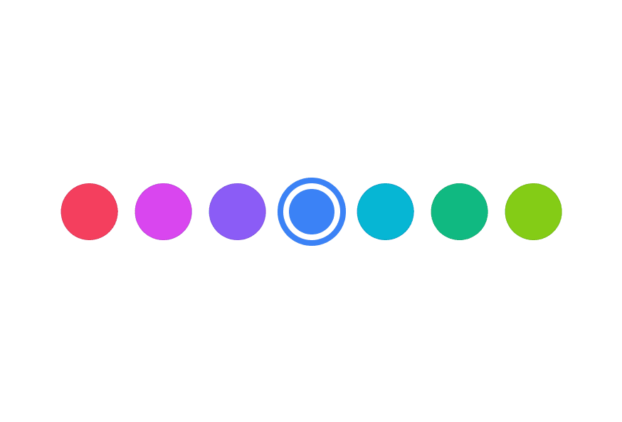
export function ColorSwatchBasic() {
return (
<div className="flex items-center gap-3">Sizes
import {ColorSwatch} from "@heroui/react";

export function ColorSwatchSizes() {
  return (
<div className="flex items-center gap-3">Shapes
import {ColorSwatch} from "@heroui/react";

export function ColorSwatchShapes() {
  return (
    <div className="flex items-center gap-3">
      <ColorSwatch color="#0485F7" shape="circle" />
      <ColorSwatch color="#0485F7" shape="square" />
    </div>
  );
}Transparency
import {ColorSwatch} from "@heroui/react";

export function ColorSwatchTransparency() {
  return (
<div className="flex items-center gap-3">Custom Styles with Render Props
You can use the style render props to access the color value and create custom visual effects.
Glow Effect
Gradient
"use client";

import {ColorSwatch} from "@heroui/react";

export function ColorSwatchCustomStyles() {Accessibility
Use colorName to provide a custom accessible name for the color, and aria-label to add context about how the color is used.
import {ColorSwatch} from "@heroui/react";

export function ColorSwatchAccessibility() {
  return (
<div className="flex items-center gap-3">Styling
Passing Tailwind CSS classes
import {ColorSwatch} from '@heroui/react';

function CustomColorSwatch() {
  return (
    <ColorSwatch
      className="size-12 rounded-lg"
      color="#0485F7"
    />
  );
}
Customizing the component classes
To customize the ColorSwatch component classes, you can use the @layer components directive.
Learn more.
@layer components {
  .color-swatch {
    @apply border-2 border-white;
  }
}
HeroUI follows the BEM methodology to ensure component variants and states are reusable and easy to customize.
CSS Classes
The ColorSwatch component uses these CSS classes (View source styles):
Base Classes
.color-swatch- Base swatch styles with checkered background for transparency
Shape Classes
.color-swatch--circle- Circular shape (default).color-swatch--square- Square shape with rounded corners
Size Classes
.color-swatch--xs- Extra small (16px).color-swatch--sm- Small (24px).color-swatch--md- Medium (32px, default).color-swatch--lg- Large (36px).color-swatch--xl- Extra large (40px)
API Reference
ColorSwatch Props
| Prop | Type | Default | Description |
|---|---|---|---|
color | string | Color | - | The color value to display (hex, rgb, hsl, etc.) |
colorName | string | - | Accessible name for the color (overrides auto-generated description) |
className | string | - | Additional CSS classes |
shape | "circle" | "square" | "circle" | Shape of the swatch |
size | "xs" | "sm" | "md" | "lg" | "xl" | "md" | Size of the swatch |
style | CSSProperties | ((renderProps) => CSSProperties) | - | Inline styles or render props function with access to color |
aria-label | string | - | Accessible label for the swatch |
Style Render Props
When using the style prop as a function, you receive render props with access to the color:
<ColorSwatch
  color="#0485F7"
  style={({ color }) => ({
    boxShadow: `0 4px 14px ${color.toString("css")}80`,
  })}
/>
The color object provides methods like:
color.toString("css")- Returns CSS color stringcolor.toString("hex")- Returns hex color stringcolor.getChannelValue("alpha")- Returns alpha channel value