Surface
Container component that provides surface-level styling and context for child components
Import
import { Surface } from '@heroui/react';Usage
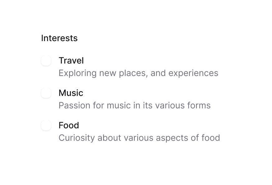
Default
Surface Content
This is a default surface variant. It uses bg-surface styling.
Secondary
Surface Content
This is a secondary surface variant. It uses bg-surface-secondary styling.
Tertiary
Surface Content
This is a tertiary surface variant. It uses bg-surface-tertiary styling.
Transparent
Surface Content
This is a transparent surface variant. It has no background, suitable for overlays and cards with custom backgrounds.
import {Surface} from "@heroui/react";

export function Variants() {
  return (
<div className="flex flex-col gap-4">Overview
The Surface component is a semantic container that provides different levels of visual prominence through variants.
Variants
Surface comes in semantic variants that describe their prominence level:
default- Standard surface appearance (bg-surface)secondary- Medium prominence (bg-surface-secondary)tertiary- Higher prominence (bg-surface-tertiary)
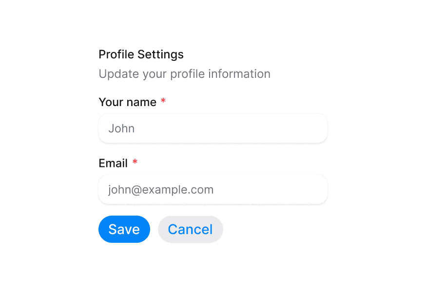
Usage with Form Components
When using form components inside a Surface, use the variant="secondary" prop to apply the lower emphasis variant suitable for surface backgrounds.
import { Surface, Input, TextArea } from '@heroui/react';

function App() {
  return (
    <Surface variant="default">
      <Input placeholder="Input with secondary variant" variant="secondary" />
      <TextArea placeholder="TextArea with secondary variant" variant="secondary" />
    </Surface>
  );
}
Styling
Passing Tailwind CSS classes
import { Surface } from '@heroui/react';

function CustomSurface() {
  return (
    <Surface
      className="rounded-2xl p-8 shadow-lg"
      variant="secondary"
    >
      <h2>Custom Styled Surface</h2>
      <p>Content goes here</p>
    </Surface>
  );
}
Customizing the component classes
To customize the Surface component classes, you can use the @layer components directive.
Learn more.
@layer components {
  .surface {
    @apply rounded-2xl border border-border;
  }

  .surface--secondary {
    @apply bg-gradient-to-br from-blue-50 to-purple-50;
  }
}
HeroUI follows the BEM methodology to ensure component variants and states are reusable and easy to customize.
CSS Classes
The Surface component uses these CSS classes (View source styles):
Base Classes
.surface- Base surface container
Variant Classes
.surface--default- Default surface variant (bg-surface).surface--secondary- Secondary surface variant (bg-surface-secondary).surface--tertiary- Tertiary surface variant (bg-surface-tertiary)
API Reference
Surface Props
| Prop | Type | Default | Description |
|---|---|---|---|
variant | "transparent" | "default" | "secondary" | "tertiary" | "default" | The visual variant of the surface |
className | string | - | Additional CSS classes |
children | ReactNode | - | The surface content |
Context API
SurfaceContext
Child components can access the Surface context to get the current variant:
import { useContext } from 'react';
import { SurfaceContext } from '@heroui/react';

function MyComponent() {
  const { variant } = useContext(SurfaceContext);
  // variant will be "transparent" | "default" | "secondary" | "tertiary" | undefined
}