TableNew
Tables display structured data in rows and columns with support for sorting, selection, column resizing, and infinite scrolling.
Import
import { Table } from '@heroui/react';Usage
| Name | Role | Status | |
|---|---|---|---|
| Kate Moore | CEO | Active | kate@acme.com |
| John Smith | CTO | Active | john@acme.com |
| Sara Johnson | CMO | On Leave | sara@acme.com |
| Michael Brown | CFO | Active | michael@acme.com |
import {Table} from "@heroui/react";

export function Basic() {
  return (
<Table>Anatomy
Import the Table component and access all parts using dot notation.
import { Table } from '@heroui/react';

export default () => (
  <Table>
    <Table.ScrollContainer>
      <Table.Content aria-label="Example table">
        <Table.Header>
          <Table.Column>Name</Table.Column>
          <Table.Column>Role</Table.Column>
        </Table.Header>
        <Table.Body>
          <Table.Row>
            <Table.Cell>Kate Moore</Table.Cell>
            <Table.Cell>CEO</Table.Cell>
          </Table.Row>
        </Table.Body>
      </Table.Content>
    </Table.ScrollContainer>
    <Table.Footer>{/* Optional footer content */}</Table.Footer>
  </Table>
);
Secondary Variant
| Name | Role | Status | |
|---|---|---|---|
| Kate Moore | CEO | Active | kate@acme.com |
| John Smith | CTO | Active | john@acme.com |
| Sara Johnson | CMO | On Leave | sara@acme.com |
| Michael Brown | CFO | Active | michael@acme.com |
import {Table} from "@heroui/react";

export function SecondaryVariant() {
  return (
<Table variant="secondary">Sorting
Columns can be made sortable using the allowsSorting prop on Table.Column. Use sortDescriptor and onSortChange on Table.Content to manage sort state.
| Name | Role | Status | |
|---|---|---|---|
| Emily Davis | Product Manager | Inactive | emily@acme.com |
| John Smith | CTO | Active | john@acme.com |
| Kate Moore | CEO | Active | kate@acme.com |
| Michael Brown | CFO | Active | michael@acme.com |
| Sara Johnson | CMO | On Leave | sara@acme.com |
"use client";

import type {SortDescriptor} from "@heroui/react";

import {Table, cn} from "@heroui/react";Selection
Enable row selection with selectionMode on Table.Content. Use Checkbox with slot="selection" for select-all and per-row checkboxes.
| Name | Role | Status | ||
|---|---|---|---|---|
| Kate Moore | CEO | Active | kate@acme.com | |
| John Smith | CTO | Active | john@acme.com | |
| Sara Johnson | CMO | On Leave | sara@acme.com | |
| Michael Brown | CFO | Active | michael@acme.com |
Selected: None
"use client";

import type {Selection} from "@heroui/react";

import {Checkbox, Table} from "@heroui/react";Custom Cells
| Worker ID | Member | Role | Status | Actions | |
|---|---|---|---|---|---|
#1234567 | ED Emily Davisemily@acme.com | Product Manager | Inactive | ||
#5273849 | JS John Smithjohn@acme.com | Chief Technology Officer | Active | ||
#4586932 | KM Kate Moorekate@acme.com | Chief Executive Officer | Active | ||
#8293746 | MB Michael Brownmichael@acme.com | Chief Financial Officer | Active | ||
#7492836 | SJ Sara Johnsonsara@acme.com | Chief Marketing Officer | On Leave |
"use client";

import type {Selection, SortDescriptor} from "@heroui/react";

import {Avatar, Button, Checkbox, Chip, Table, cn} from "@heroui/react";Pagination
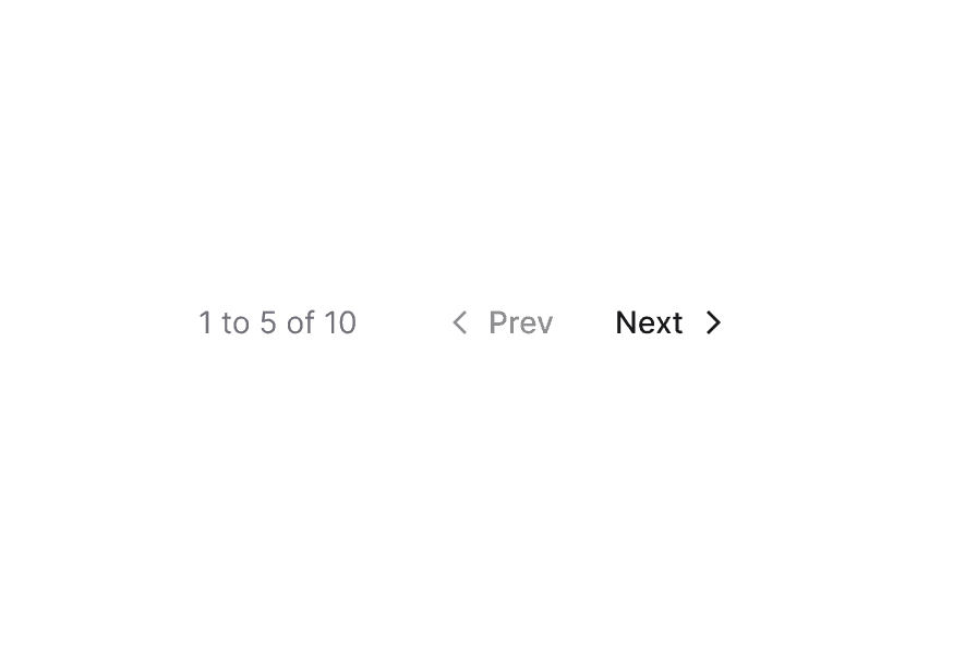
Use Table.Footer to add a pagination component below the table.
| Name | Role | Status | |
|---|---|---|---|
| Kate Moore | CEO | Active | kate@acme.com |
| John Smith | CTO | Active | john@acme.com |
| Sara Johnson | CMO | On Leave | sara@acme.com |
| Michael Brown | CFO | Active | michael@acme.com |
"use client";

import {Pagination, Table} from "@heroui/react";
import {useMemo, useState} from "react";
Column Resizing
Wrap the table in Table.ResizableContainer and add Table.ColumnResizer inside each resizable column.
| Name | Role | Status | |
|---|---|---|---|
| Kate Moore | CEO | Active | kate@acme.com |
| John Smith | CTO | Active | john@acme.com |
| Sara Johnson | CMO | On Leave | sara@acme.com |
| Michael Brown | CFO | Active | michael@acme.com |
| Emily Davis | Product Manager | Inactive | emily@acme.com |
import {Chip, Table} from "@heroui/react";

export function ColumnResizing() {
  return (
<Table>Empty State
Use renderEmptyState on Table.Body to display a custom message when the table has no data.
| Name | Role | Status | |
|---|---|---|---|
No results found | |||
"use client";

import {EmptyState, Table} from "@heroui/react";
import {Icon} from "@iconify/react";
Async Loading
Use Table.LoadMore for infinite scrolling. It renders a sentinel row that triggers onLoadMore when scrolled into view.
| Name | Role | Status | |
|---|---|---|---|
| Kate Moore | CEO | Active | kate@acme.com |
| John Smith | CTO | Active | john@acme.com |
| Sara Johnson | CMO | On Leave | sara@acme.com |
| Michael Brown | CFO | Active | michael@acme.com |
| Emily Davis | Product Manager | Inactive | emily@acme.com |
| Davis Wilson | Lead Designer | Active | davis@acme.com |
"use client";

import {Chip, Spinner, Table} from "@heroui/react";
import {useCallback, useRef, useState} from "react";
TanStack Table
HeroUI's Table works as a rendering layer on top of headless table libraries. This example uses TanStack Table for column definitions, sorting, and pagination — while HeroUI handles styling and accessibility.
| Name | Role | Status | |
|---|---|---|---|
| Kate Moore | CEO | Active | kate@acme.com |
| John Smith | CTO | Active | john@acme.com |
| Sara Johnson | CMO | On Leave | sara@acme.com |
| Michael Brown | CFO | Active | michael@acme.com |
"use client";

import type {SortDescriptor} from "@heroui/react";
import type {SortingState} from "@tanstack/react-table";
Styling
Passing Tailwind CSS classes
You can customize individual Table parts:
import { Table } from '@heroui/react';

function CustomTable() {
  return (
    <Table className="border border-purple-200">
      <Table.ScrollContainer>
        <Table.Content aria-label="Custom styled table">
          <Table.Header className="bg-purple-50">
            <Table.Column>Name</Table.Column>
          </Table.Header>
          <Table.Body>
            <Table.Row className="hover:bg-purple-50">
              <Table.Cell>Kate Moore</Table.Cell>
            </Table.Row>
          </Table.Body>
        </Table.Content>
      </Table.ScrollContainer>
    </Table>
  );
}
Customizing the component classes
To customize the Table component classes, you can use the @layer components directive.
Learn more.
@layer components {
  .table-root {
    @apply relative grid w-full overflow-clip;
  }

  .table__header {
    @apply bg-gray-100;
  }

  .table__column {
    @apply px-4 py-2.5 text-left text-xs font-medium text-gray-600;
  }

  .table__row {
    @apply bg-white border-b border-gray-200;
  }

  .table__cell {
    @apply px-4 py-3 text-sm;
  }

  .table__footer {
    @apply flex items-center px-4 py-2.5;
  }
}
HeroUI follows the BEM methodology to ensure component variants and states are reusable and easy to customize.
CSS Classes
The Table component uses these CSS classes (View source styles):
Base Classes
.table-root- Root container (namedtable-rootinstead oftablebecausetableis a built-in Tailwind CSS utility class fordisplay: table).table__scroll-container- Horizontal scroll wrapper with custom scrollbar.table__content- The<table>element.table__header- Header row (<thead>).table__column- Column header cell (<th>).table__body- Body section (<tbody>).table__row- Row element (<tr>).table__cell- Data cell (<td>).table__footer- Footer container (outside table)
Advanced Classes
.table__column-resizer- Drag handle for column resizing.table__resizable-container- Wrapper enabling column resizing.table__load-more- Sentinel row for infinite scrolling.table__load-more-content- Styled container for the loading indicator
Variant Classes
.table-root--primary- Gray background container with card-style body (default).table-root--secondary- No background, standalone rounded headers
Interactive States
The Table supports both CSS pseudo-classes and data attributes for flexibility:
- Hover:
:hoveror[data-hovered="true"](row background change) - Selected:
[data-selected="true"](row highlight) - Focus:
:focus-visibleor[data-focus-visible="true"](inset focus ring on rows, columns, and cells) - Disabled:
:disabledor[aria-disabled="true"](reduced opacity) - Sortable:
[data-allows-sorting="true"](interactive cursor on columns) - Dragging:
[data-dragging="true"](reduced opacity) - Drop Target:
[data-drop-target="true"](accent background)
API Reference
Table Props
| Prop | Type | Default | Description |
|---|---|---|---|
variant | "primary" | "secondary" | "primary" | Visual variant. Primary has a gray background container; secondary is flat with transparent rows. |
className | string | - | Additional CSS classes for the root container |
children | React.ReactNode | - | Table content (ScrollContainer, Footer, etc.) |
Table.ScrollContainer Props
| Prop | Type | Default | Description |
|---|---|---|---|
className | string | - | Additional CSS classes |
children | React.ReactNode | - | Table.Content element |
Table.Content Props
Inherits from React Aria Table.
| Prop | Type | Default | Description |
|---|---|---|---|
aria-label | string | - | Accessible label for the table |
selectionMode | "none" | "single" | "multiple" | "none" | Selection behavior |
selectedKeys | Selection | - | Controlled selected keys |
onSelectionChange | (keys: Selection) => void | - | Selection change handler |
sortDescriptor | SortDescriptor | - | Current sort state |
onSortChange | (descriptor: SortDescriptor) => void | - | Sort change handler |
className | string | - | Additional CSS classes |
Table.Header Props
Inherits from React Aria TableHeader.
| Prop | Type | Default | Description |
|---|---|---|---|
columns | T[] | - | Dynamic column data for render prop pattern |
children | React.ReactNode | (column: T) => React.ReactNode | - | Static columns or render prop |
Table.Column Props
Inherits from React Aria Column.
| Prop | Type | Default | Description |
|---|---|---|---|
id | string | - | Column identifier |
allowsSorting | boolean | false | Whether the column is sortable |
isRowHeader | boolean | false | Whether this column is a row header |
defaultWidth | string | number | - | Default width for resizable columns |
minWidth | number | - | Minimum width for resizable columns |
children | React.ReactNode | (values: ColumnRenderProps) => React.ReactNode | - | Column content or render prop with sort direction |
Table.Body Props
Inherits from React Aria TableBody.
| Prop | Type | Default | Description |
|---|---|---|---|
items | T[] | - | Dynamic row data for render prop pattern |
renderEmptyState | () => React.ReactNode | - | Content to display when the table is empty |
children | React.ReactNode | (item: T) => React.ReactNode | - | Static rows or render prop |
Table.Row Props
Inherits from React Aria Row.
| Prop | Type | Default | Description |
|---|---|---|---|
id | string | number | - | Row identifier |
className | string | - | Additional CSS classes |
children | React.ReactNode | - | Row cells |
Table.Cell Props
Inherits from React Aria Cell.
| Prop | Type | Default | Description |
|---|---|---|---|
className | string | - | Additional CSS classes |
children | React.ReactNode | - | Cell content |
Table.Footer Props
| Prop | Type | Default | Description |
|---|---|---|---|
className | string | - | Additional CSS classes |
children | React.ReactNode | - | Footer content (e.g., pagination) |
Table.ColumnResizer Props
Inherits from React Aria ColumnResizer.
| Prop | Type | Default | Description |
|---|---|---|---|
className | string | - | Additional CSS classes |
Table.ResizableContainer Props
Inherits from React Aria ResizableTableContainer.
| Prop | Type | Default | Description |
|---|---|---|---|
className | string | - | Additional CSS classes |
children | React.ReactNode | - | Table.Content element |
Table.LoadMore Props
Inherits from React Aria TableLoadMoreItem.
| Prop | Type | Default | Description |
|---|---|---|---|
isLoading | boolean | false | Whether data is currently loading |
onLoadMore | () => void | - | Handler called when the sentinel row is visible |
children | React.ReactNode | - | Loading indicator content |
Table.LoadMoreContent Props
| Prop | Type | Default | Description |
|---|---|---|---|
className | string | - | Additional CSS classes |
children | React.ReactNode | - | Loading indicator content (e.g., Spinner) |
Table.Collection Props
Re-exported from React Aria Collection. Used to render dynamic cells within rows alongside static cells (e.g., checkboxes).
| Prop | Type | Default | Description |
|---|---|---|---|
items | T[] | - | Collection items |
children | (item: T) => React.ReactNode | - | Render prop for each item |